>Does Bottle Design Complement or Compete with Spirit Quality?
By Kathleen Reynolds, KReyRecommends.com
 www.skinnygirlcocktails.com) has warranted disdain from countless spirits professionals – and raked in thousands for its creator. Beyond the media-saturated spokesperson and mass-friendly pricing, there is no denying the level of awareness behind the SkinnyGirl brand, which is clearly represented on every bottle. And it begs the question: when it comes to wine and spirits – do looks really matter?
The short answer? Yes. Of course. A number of bartenders and spirits professionals interviewed insisted looks have little to no bearing on their preferences. Most would opt for austere design if it came with a superior spirit. But they recognize that consumers buy with their eyes. And if it really didn’t matter, companies would not invest in a bottle’s looks or labels. The truth is, a modern meal isn’t complete without creative plating and most imbibers are eyeing bottles like they would book covers or eHarmony photos. They want the spirit to speak to them before the first sip. But there’s a fine line between whetting the palette over-promising on looks while disappointing on taste.

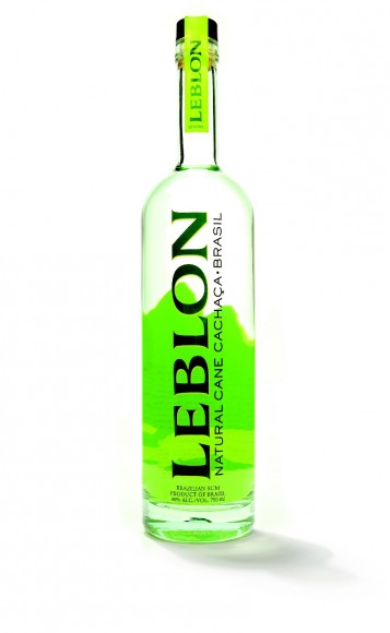
Marketers can go through elaborate measures to ensure their end product is consistent with their brand’s core. For Leblon USA (www.lebloncachaca.com), a premium, small batch cachaça that’s been on the market since 2005, the bottle was designed with an internal mantra in mind, according to Steve Luttman, President and Founder. “We’re always thinking about S.N.T. – sensual, natural, together.” Luttman wants anyone who sees his product to feel they could “travel to Rio in a bottle.” According to him, “When you’re selling spirits, you’re selling a cheap plane ticket.” Everything from the exotic font used, to the mountain landscape in the background, to the carefully-selected lime green colors, is intended to transport a person to Brazil’s famous beaches. The creative process began in Luttman’s mind, and its remnants remain on his office wall five years later to keep him focused. After writing the central concept, Luttman created an idea board and mocked up a basic logo. From there, he consulted with Paul McDowell Design to turn his vision into reality. They tested prototypes with consumers and industry professionals along the way, and have not veered from the initial design since launching five years ago.
How does Luttman know it’s effective? He describes honing his sales pitch and to avoid launching into a hard sell right away. “I just put the bottle on the bar, and it immediately generates a response and starts the conversation. He recognizes that bottle design only goes so far. “Looks just get us in the door. The juice has to speak for itself. If it doesn’t, we’re screwed.”
Toby Maloney, a partner with Alchemy Consulting (www.alchemyconsultingnyc.com) and head mixologist for the Violet Hour in Chicago (www.theviolethour.com) and the Patterson House in Nashville (www.thepattersonnashville.com) who has unscrewed his fair share of bottle caps, agrees that a bottle’s most important feature is the liquid inside. “I don’t judge booze by the bottle,” Maloney said. “Money being poured into marketing could often be better spent on making a quality liquid. I don’t get marred by marketing propaganda.” However, Maloney concedes that design matters to a certain extent. “Even if I liked it, I couldn’t imagine stocking something that looked like it was designed by a sixteen-year-old ‘Dungeons and Dragons’ fan.” Maloney also consciously arranges the back bar to highlight bottles he feels are most striking, like “St. Germain (www.stgermain.fr) or anything from Haus Alpenz” (www.alpenz.com whose portfolio includes Dolin Vermouth and Crème de Violette). “They’re beautiful and they’re shaped so differently.”
From a bartending and serving perspective, Maloney underscores the impact that shape has on functionality, and has counseled spirits makers on the subject. “I want something that feels good in the hand and isn’t clunky.” In his opinion, square bottles are more difficult to handle for the speed rail, while round bottles with solid necks are efficient and preferable. He also warns that some features added for convenience may be anything but: “built-in speed pourers should really go away – they’re thoroughly annoying.”
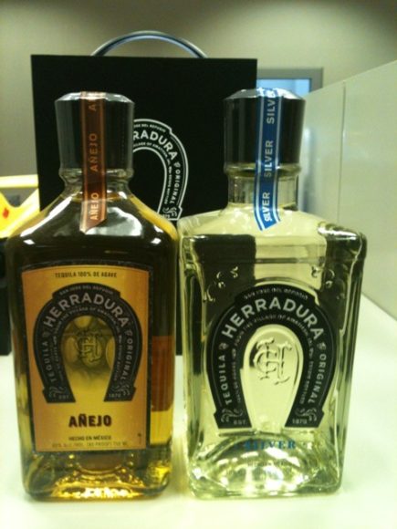
Herradura (www.herradura.com), a tequila which is all about the process, took great care to consider functionality as well as tradition when unveiling their new bottle. Their products are crafted using traditional and time-intensive methods, such as cooking agave in clay ovens and fermenting with wild yeast. Contrasting this old-school dedication is a newly-designed bottle, which gives off a slick, streamlined appearing while still paying homage to the spirit’s heritage. Ease of use played a role here, as well, according to Mark Bacon, U.S. Director for Casa Herradura. “The new, angular shape, longer neck and side indentations made it easy to grip,” he explained. The design process lasted longer than a year, which is bit a blink of an eye for a company commemorating its 140 year anniversary. The process involved consultants like Ken, as well as consumer and industry focus groups. Bacon hopes that someone who comes upon a new bottle of Herradura will immediately get a sense of the brand’s quality and authenticity.

Authenticity wasn’t the main consideration for Jared Gufrein, co-founder, president and chief executive officer of Viridian Spirits LLC, the parent company of Lucid Absinthe (www.drinklucid.com) as he designed the brand’s label and bottle. Beyond packaging recognition Gurfein faced a distinct challenge bringing their product to market — many Americans were unfamiliar with absinthe, which had been outlawed for many years. He wanted something that would make this relative unknown appealing to a mass audience. The execution of this strategy became a moving target, as the company went through dozens of initial designs, varying from modern, to traditional, to crazy. The end result: a dark bottle set off by neon green cat eyes and a romantic scripted font. Gufrein wanted a “clean, easy-to-remember, iconic image,” and the bottle seems reminiscent of vintage Chat Noir artwork. He also always keeps the bartender in mind. “What you learn is that bartenders want the lightest, easiest thing to pick up out of the well.”
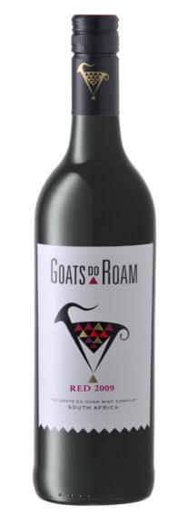
Unlike Lucid, Leblon and others that have stuck with the starting design, some brands have staged bottle makeovers. Robin Back, the U.S. brand manager for the whimsically-titled Goats do Roam (www.goatsdoroam.com), a budget wine brand, noted several reasons for behind their recent label update. Whereas older bottles featured an antique font and sketch of a goat with red and yellow color accents, new versions offer a punchier, modern, more streamlined design. Back explains that the “critter category,” or selection of wines featuring animals on the label, exploded in recent years, so the redesign was critical to set Goats do Roam apart. “Our original goat set us apart from the herd more than 10 years ago. We sought to again create a new point of differentiation.”

Aside from being unique, the bottle aims to educate about Goats do Roam’s wine-making process. Each part of the goat’s coat actually represents different varietals used to make their blends. “We have worked hard on raising the quality of Goats’ blends and wanted to prove that blended wine could be better [than single varietals]. This more serious approach to the wines demanded a more serious approach to the packaging.” But Back confesses that it didn’t come easy. The end products were selected after “sleepless nights,” numerous long distance phone calls and consultation with Vineyard Brands, key clients and consumers. Their objective: “the packaging needs to be excellent enough for people to be willing to share the wines with their friends.”
In the category of friends don’t let friends drink bad wine. Or eat unfamiliar food for that matter, there is, on the culinary side, at least one restaurant that deliberately sacrifices the aesthetic as part of the overall experience. Dans Le Noir, a “blind dining” establishment with successful European operations takes looks out of the equation. Patrons must eat in a pitch-black room while relying on other senses to enjoy their meal – and avoid spilling all over themselves. Waiters are blinded as well (chefs, fortunately, are not). The website warns that “visitors aren’t allowed to wander in the dark room, go to the restrooms or leave by themselves as it could put other customers and the waiters at risk…If you wish to do so on any occasion, make sure your waiter is informed and thus able to assist you.”
And you thought Milk and Honey’s no roaming policy was strict! What say you… do looks really matter?

